The goal of this post is to define main criteria of design evaluation for non-designers. As for me, there are two main questions in this case and answers to them should help in design evaluation. Ability to answer those questions increases the value of your point of view.
1. Why evaluate?
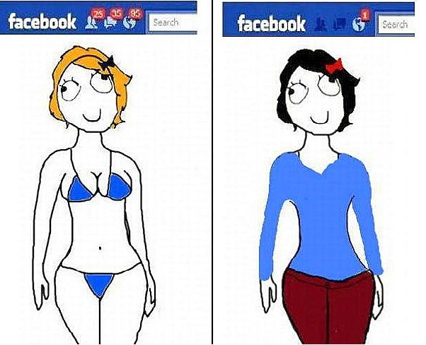
Illustration taken from Facebook.
Evaluating for yourself
When you have your own opinion, everything becomes clearer in some way. In most cases, you know if you like something, don’t like it or don’t care about it. In order to understand better and better, you just need to look deeper. For example, even if you don’t know anything about creating 3D-effects, but you have seen recent movies with those effects, it will be impossible to impress you with old 3D-effects, because you already have seen something better.
But one thing is to understand whether you like something or not, and completely different thing is to share this information with someone else.
Somebody asked your opinion about some design
It could be a designer who needs an objective critique or it could be a customer who wants to gather more opinions about his product.
First of all, your opinion might be useful because of your professional expertise and you can point out an obvious error. For example, you can say that the mechanism that designer used to illustrate some process will never work out because of some technical issues. Mistakes in the design can be invisible for people who are emotionally involved in the project and visible to other people.
The second, you are asked to say if you like some design or don’t. In this case, one single opinion makes sense only if there were several adequate people stumbled on the same item.
It is easy to point out the error which is obvious from your point of view and much more complicated is to answer the question like “What background color is better: more-blue-than-green or more-green-than-blue?”. Definition between two similar colors can be complicated because the correct answer to this question is “It doesn’t matter” or “I’m not a designer, why do you ask me?”. Therefore it is better to clarify what are you asked to evaluate and why.
2. What exactly is evaluated?
It makes no sense to assess the look-and-feel of the site in isolation from the context.
If you are asked to evaluate black vs white designs of the same application, there are at least two ways to do it. You can make a choice based on a color you just like the most or you can choose a variant which is the best according to the purposes of the application. Thus, the black background is better for video content and white background is better for the big amount of information about this video.
Imagine you have two options of one homepage – with red and blue backgrounds which is the only one difference between options. Discussing what background, in this case, is better for the homepage is equal to discussing what color is better in general. If you provide A/B testing between these options, you will not even find out which color (blue or red) your customers like the most. The point is – background color in this case does nothing with functionality and productivity of the site is determined exactly by the functionality.
A shot from “The Matrix” movie. It is improvidently to make a choice based only on your color preferences. Learn more about how color is related to content ;-)
This is similar to how the logo design influences the success of the company. There are billions different swooshes but the Nike one is the most famous. There are trillions more appropriate, beautiful and unknown apple pictures than the Apple logo. Everybody knows those logos not because they have the most beautifully curved lines but because they are used wisely.
Famous vs unknown swooshes.
An example of the design evaluation
About once a month I look for airline tickets using the next two websites: www.anywayanyday.com and www.onetwotrip.com. Both of them are handy, thought through in detail and pleasing to the eye. I’ve decided to compare their designs to have one more example for this blogpost.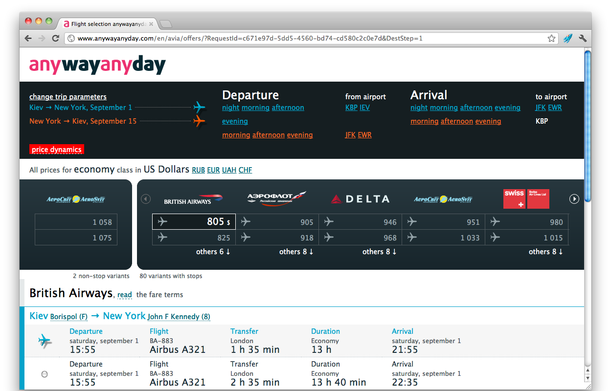
Option 1. Anywayanyday tickets search result.
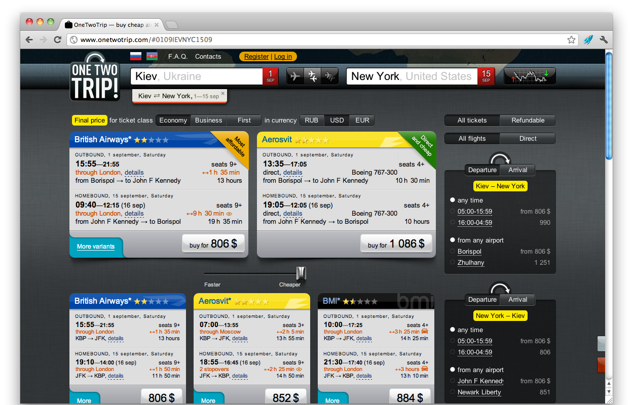
Option 2. Onetwotrip tickets search result.
Once enjoyed by both, I realized that I prefer the first one. The main reason was – I love its interaction. The second reason – I wasn’t diverted by the extra eye candy. As for me, there are too much graphical information on onetwotrip.com and I pay attention to it every time I use the app. But it doesn’t mean the onetwotrip.com is bad. It means specifically I like it less. Those for whom an explicit portrayal of the beauty and details matter more than for me, with other conditions being equal, will choose the second option.
The power of both services is that they are handy. If there were no pretty pictures on these sites, they would be just an ornament of corpses.
So design matters. It increases the pleasure of using the product. Pleasure means exactly what it means for everyone. If the design touches and attracts – it creates additional demand for well-done applications.