
While we’ve been developing one of our products (Mailtrap), we needed to create 2 column page layout with inner blocks stretching down to the whole height of browser window with sticky footer and header.
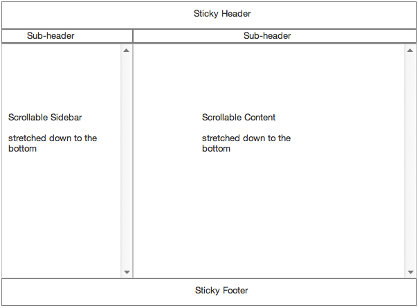
The page layout looks like this:
This layout has several nesting levels which makes it more complicated to implement with pure CSS.
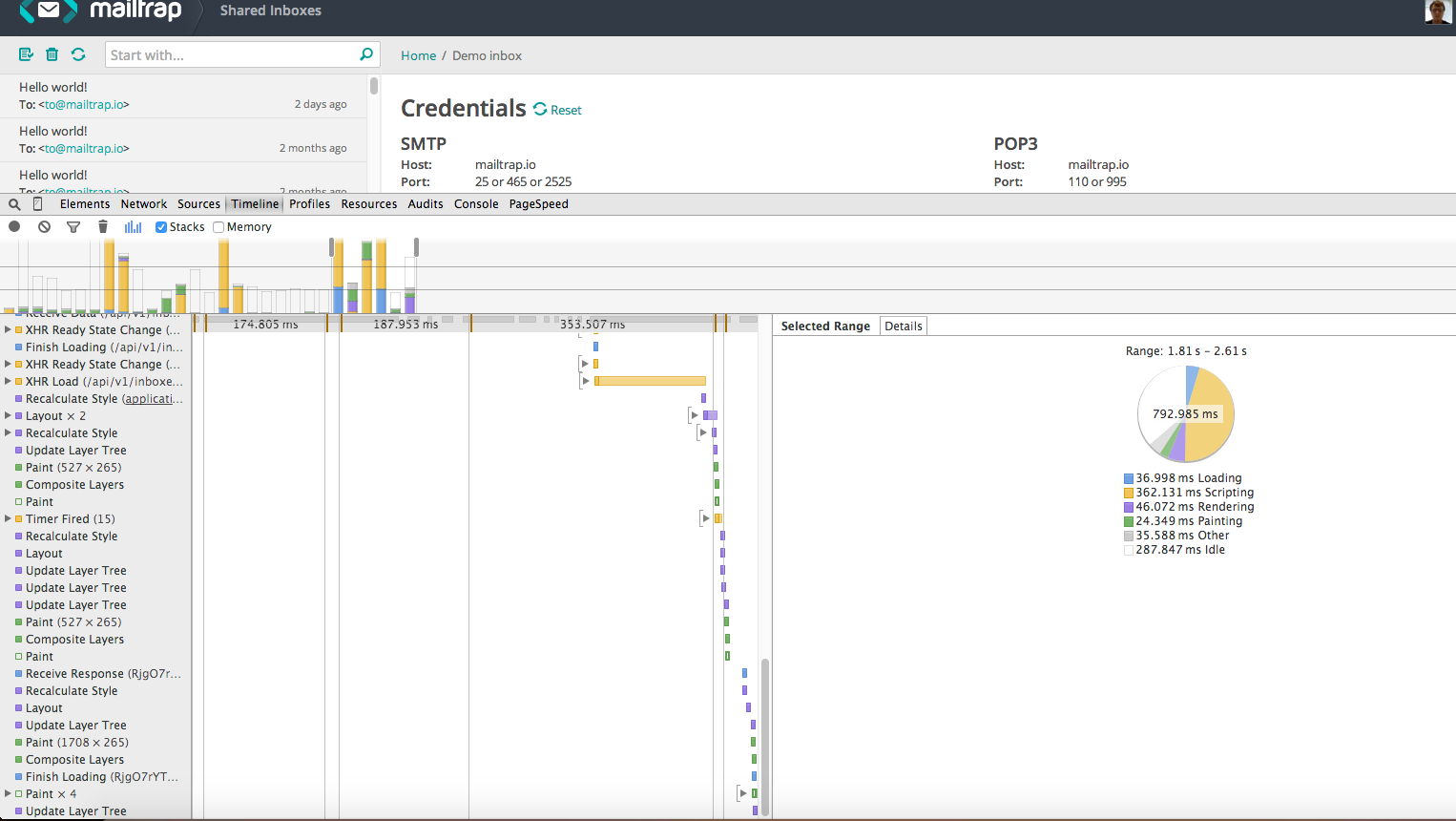
Dynamic height calculation and reflow problem
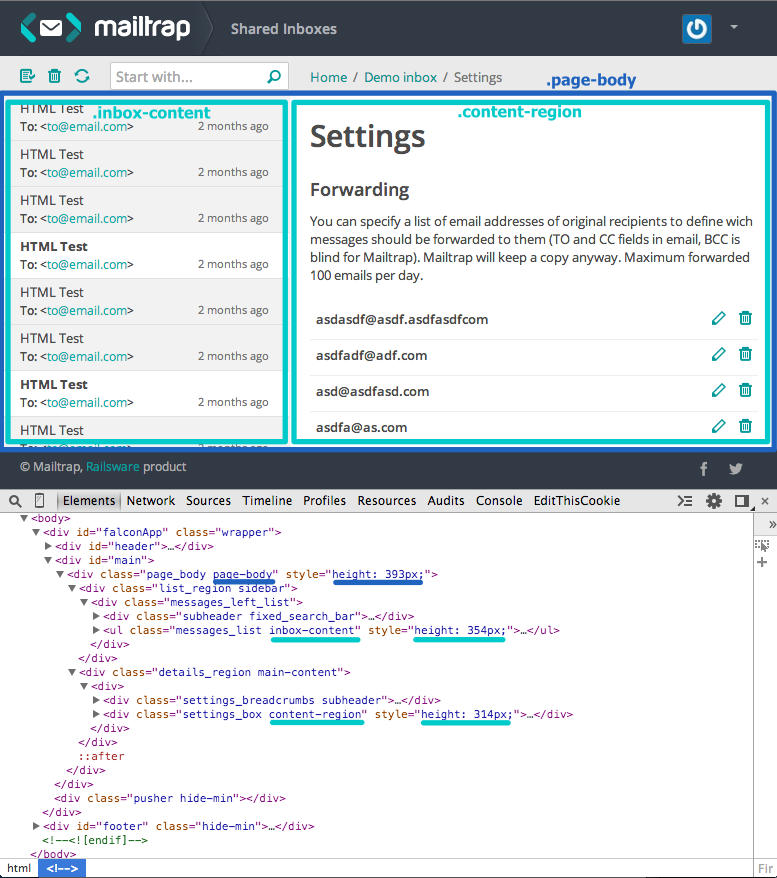
The initial implementation was adding js method that adds height to the target blocks so that it would look like this:
The issue of this implementation is layout operation (aka reflow) – the process of constructing a render tree from a DOM tree. Once the render tree is constructed, the browser paints the render tree nodes on the screen. Changing the input information which was used to construct the render tree may result in additional layout operation.
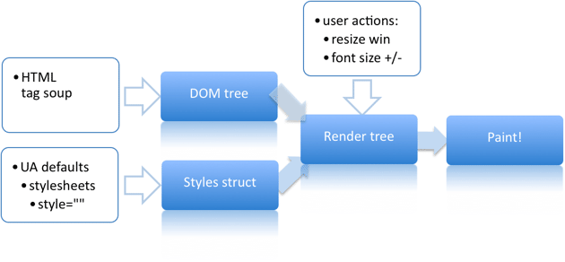
So, in our case, triggering the dynamic height of blocks causes parts of the render tree to be revalidated (https://csstriggers.com/#height). This is one of potentially costly operations and the larger and more complex the DOM is, the more expensive this operation may be (they can hurt the user experience, and make the UI appear sluggish).
Flexbox
And here comes flexbox – a new layout mode in CSS3.
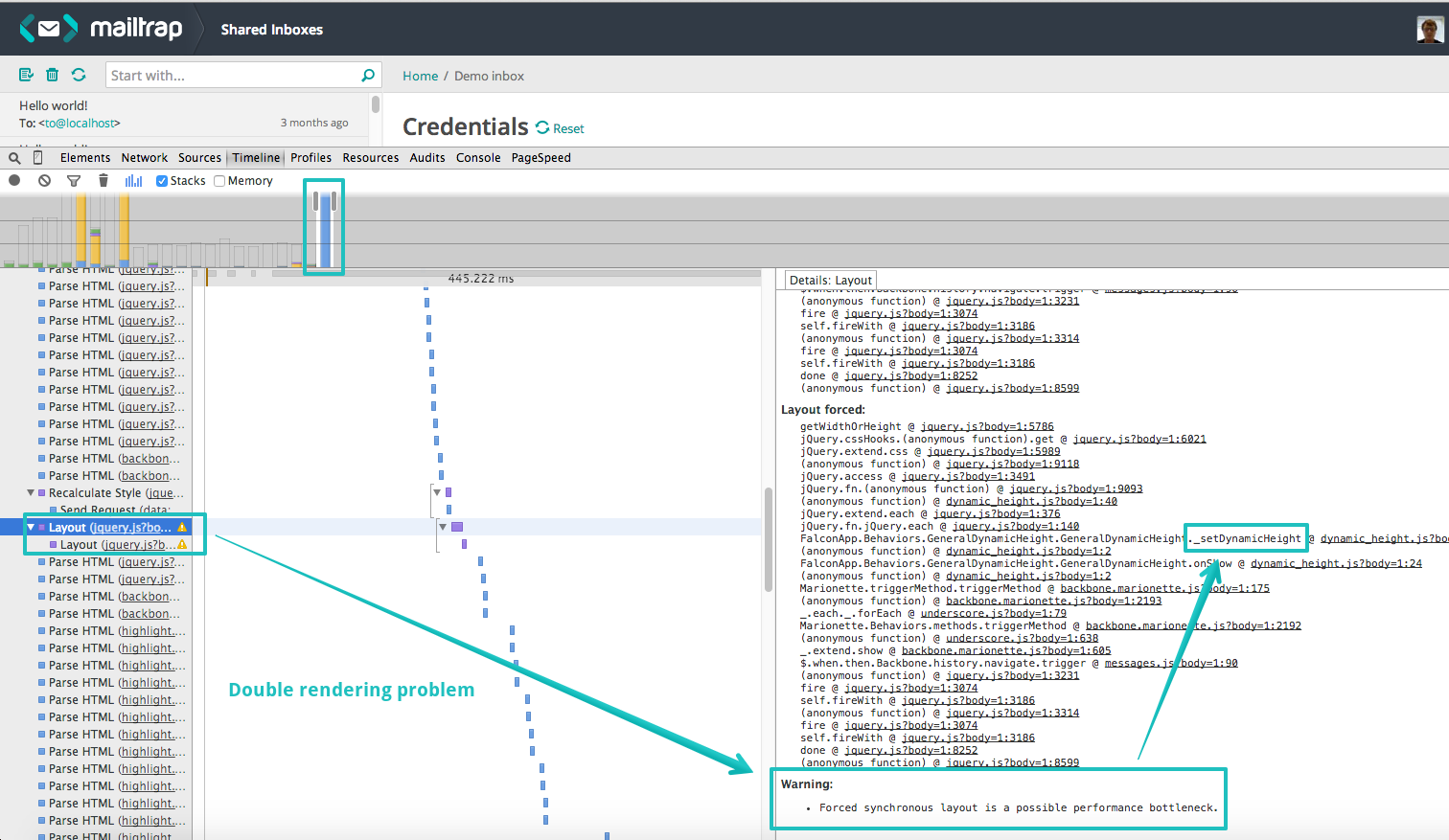
It allows having blocks fill up all the height of a parent block without js method of dynamic height calculation which can affect performance. After implementing flexbox there is no double rendering issue:
Browser support and js height method as a fallback
Flexbox has quite good browser support today (Chrome, Firefox, Safari, Opera Presto, IE 11, iOS and Android). But the trick is that Flexbox spec has an old and new versions of it and IE stands out among others using some hybrid of old and new flexbox syntax.
That’s why in our project we let Autoprefixer deal with all browser prefixing and Modernizr detect flexbox support and provide fallbacks.
We decided not to worry about legacy flexbox syntax and its partial support. Modernizr flags html tag with .flexboxlegacy or .no-flexbox classes in case of browsers which support only legacy syntax or don’t support flexbox at all and we turn on js method of adding height for them.
So, we’ve got a good browser support.
Implementation
Here’s how flexbox works for us. You just need to specify a parent block as a flex container (display: flex) and all its children become flex item whose flexibility can be set by different properties (flex: 1 1 auto).
For a simple page layout it will look like this.
We provide html, body and .wraper block with 100% height and we get the remaining blocks stretched by applying flexbox.
.wrapper
  display: flex /*specify wrapper as the flex container, makes its children flex items and stretch them to fill all the space.*/
  flex-direction: column /*sets direction of flex item in container: lays them out in vertical columns since we have .main and .header blocks as direct childs*/

.main
  flex: 1 /*the shorthand for flex-grow, flex-shrink and flex-basis, the same as flex: 1 1 auto (It can grow, shrink and has default size auto). The flex item fills all available space while by default it will be stretched to fill the container.*/
  display: flex /*specify flex context for .sidebar and .content blocks*/

.sidebar
  width: 300px /*We can leave .sidebar as it is since it is already flex item with default properties (flex: 0 1 auto - can't grow, can shrink) and it's default width:300px is defined already*/

.sidebar, .content
  display: flex /*sets flex context for the next elements*/
  flex-direction: column

.content,
.sidebar-content,
.content-region
  flex: 1
See the Pen Flexbox-part1-simple layout by Railswarian (@railswarian) on CodePen.
Powerful! But real life is not that simple. Our page layout has nested structure having elements which serve no purpose beyond making the layout work and we can’t get rid of them. And flex container enables a flex context only for its direct children. So our solution in this case is to define all nested blocks as flex so that they can stretch and fill all the space. In order to make it in a bit more neat way, we create flexbox silent classes and extend needed required with them. The styles are the following:
//  Flexbox silent classes
%flex-container
  display: flex

%flex-container-col
  @extend %flex-container
  flex-direction: column

%flex-item
  flex: 1

// Additional flexbox classes
.flex-container
  @extend %flex-container

.flex-container-col
  @extend %flex-container-col

.flex-item
  @extend %flex-item

// Flexbox layout extended by silent classes
.wrapper
  @extend %flex-container-col

.main,
.page-body
  @extend %flex-item
  @extend %flex-container

.sidebar
  @extend %flex-container-col

.content
  @extend %flex-item
  @extend %flex-container-col

.sidebar-content, .content-region
  @extend %flex-item
See the Pen Flexbox-part2-complex layout by Railswarian (@railswarian) on CodePen.
You can move flexbox silent classes to special utils assets file for better structuring.
When you add flexbox properties, other properties like floats and display: block will have no affect.
Scrollable flex items
Next, our goal is to make .content-region and .sidebar-content blocks scrollable vertically as it was with dynamic height.
To accomplish this, we set the following properties to these blocks. And again, we use silent class to extend all the required blocks with it.
// Silent class for scrollable block
.flexbox
  %flex-item-scrollable
    flex: 1 1 auto
    height: 0

// General class for setting scroll for all target blocks
.scrollable
  overflow-y: scroll
  &.flex-item
    @extend %flex-item-scrollable

// Layout classes
.sidebar-content,
.content-region
  @extend %flex-item-scrollable
See the Pen Flexbox-part3-scrollable items by Railswarian (@railswarian) on CodePen.
We specify the initial main size of the flex item by adding height: 0. Flex basis auto retrieves the value of the main size property and then the height is recalculated according to the flex factor 1 scaling to all free space.
Also note that we apply these properties only if html has .flexbox class so that it won’t cause undesired behavior in the browsers without flexbox support.
Known issues of flexbox
Despite of a quite good way of providing flexbox fallbacks, we came across some issues and of course it was in IE browser. Our main .wrapper block has min-height: 100% and no explicit height property. The issue is that in IE10 and IE11, containers with display: flex and flex-direction: column will not properly calculate their flexible childrens’ sizes if the container has min-height but no explicit height property. In our case the flex items are not stretched out. So, keep in mind that you need to set height: 100% if you have similar case.
There are also a few other bugs that’d be better taken into consideration while working with flexbox.
For instance, in our case we have .subheader blocks as inner nonflex items of sidebar and .content flex container. It has height property in px: height: 40px. If you set it in percentage, you’ll have an issue in Chrome and Safari since the height of non flex children are not recognized in percentages there.
Other pitfalls of flexbox
Showing/hiding flexbox blocks with jQuery method
If you need to show/hide blocks which you define as flex containers and you use jQuery method .show/ keep in mind that it will override you css properties display:flex since jQuery method .show adds inline styles display:block to your element. That’s why the better solution to use jQuery methods addClass/removeClass to add/remove class .hidden in order to show/hide a flexbox block .
PhantomJS rendering problem
In our project, we use PhantomJS for automation testing of our application. After implementing flexbox PhantomJS stopped working. A page couldn’t be rendered in a valid way because PhantomJS somehow uses legacy flexbox syntax. That’s why we had to define all our flexbox css implementation for html.flexbox by Modernizer library.
Conclusion
If you need your blocks to have dynamic height, flexbox is a good alternative to js method of blocks height calculation that can affect performance of your page.
Yes, flexbox might be not very appropriate for large scale layouts and it has a few known issues in browsers, but still it works good in a wide range of browsers and, unlike dynamic height, improves your page performance. Anyway, flexbox brings some very exciting possibilities and deserves to be considered.