For the first two years of being a front-end developer, my method was fairly simple: I would put up a fairly simple site layout, estimate development time, and then proceed with quick markup coding. Typically, there was no time allocated for corrections and polishing and the development was based on a single principle: to make it fast and workable. Naturally, this is not noticeable on small sites, who do not have to worry about the reasonableness and reusable elements, but if this was the case on a large project difficulties would kick in.
The first and main problem is the accumulation of the code, which happens because the code depends on the location. Even a simple item you create in header was impossible to move in the content area, and I had to write essentially the same thing twice.
Next there is a problem finding the desired item in the code to edit it, because it’s all written in one file. All this is not a problem when you only need to quickly get your job done and get the money. However any corrections in future may become a fairly big problem when editing in one place and cause virtually hidden errors elsewhere.
I learned about OOCSS (object oriented CSS) from classes of Vadim Patsev (Yandex), though they call it BEM-technique (block element modifier). The main principle of OOCSS is code REUSABILITY. After i came in Railsware it all became much clearer and the question about why should i make it in that way have disappeared by itself. Lets take a closer look to OOCSS now.

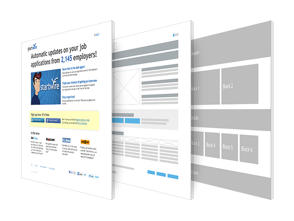
PSD separation into blocks
Where to start
After getting the design and first looking at the layout wait a bit, close your IDE/editor. Forget all your fast slicing and coding methods which will only hurt. Open Photoshop and primarily divide layout to objects: separately background elements, separately those that are responsible for the text size. Usually at the beginning of the project, not all pages layouts are available, and the main thing here is to choose the most appropriate naming for a class of objects that are universal to what is possible, but at the same time carry information about the content. Then you create a library. This is HTML document with all the elements without indentation, which then will be inserted into pages.
 Example of separation of objects and modules in PSD
CSS collection
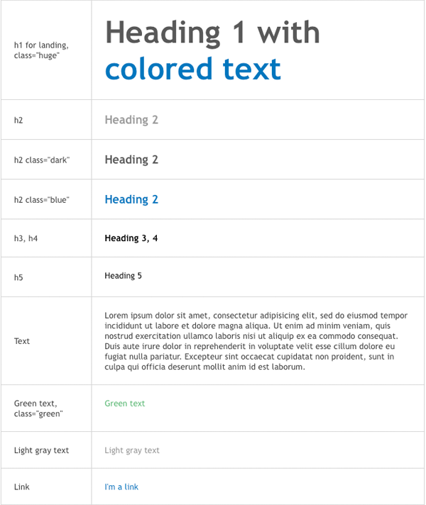
Time to talk about CSS. Many of its features are here too. It is divided into the following types: layout, library, grids, group, module. Layout includes information about the main elements: body, header, footer, content, as it stores the position of the objects. Library is responsible for all the simple elements that can make the modules and the modules in turn, are objects unifying within themselves the elements of the library. The same items from the library shall be put into groups, such as a group of lists or group of buttons. Grids – CSS styles that are responsible for the width of columns. Different pages can have own layouts. The flexibility of this method is that you can decide which CSS files include into the page. You may not include the modules that are not present on this page.  Example of a library
Design features
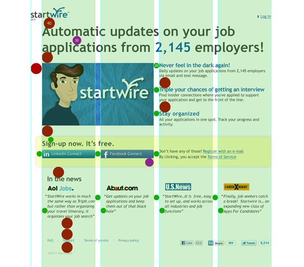
Designers in this case, too, are subjects to change the way they work. Now they need to think of paddings and breaking them ideally into 3 categories: small, medium, large. Front-end developer formed CSS grid with the class for each type of padding (for example, .mts – margin top small). This grid serves to separate objects with each other, but not for indenting elements inside the object. 
Spacing and grid
Just put it together
Only final step left: using objects and paddings to put together the page. Practice has shown that keeping library up to date makes OOCSS development much faster. OOCSS is not a panacea and not a paradigm, it is only a direction. So far, even within one company, the nuances OOCSS can be interpreted in different ways, the only question of time and knowledge sharing. Every day opens new merits of the method and pitfalls. All this in more details in the near future. Stay tuned.
