
There’s more than one reason for that, and I don’t claim to have the cure. However, anyone can take their decision-making game to the next level by seizing the right approaches. Even the most unglamorous of tools – the spreadsheet – holds a ton of potential. You just need to know how to organize and customize it properly.
So, let me introduce the concept of 3D View of Data – a clever way to squeeze more business insights out of your spreadsheet dashboards. It won’t take long to implement this approach and see the benefits, which include easier access to contextual data, improved focus, and a faster decision-making process in general.


What is a 3D View of Data?
A 3D View of Data is an approach to consolidating business data in a large, well-organized spreadsheet. It’s a convenient way to analyze related data in one place, without overcrowding the dashboard or overwhelming yourself.
In more technical terms, it involves embedding additional data within a spreadsheet row, cell, or column. Only by clicking on the element can you reveal this bonus information. In an instant, you get a compact, layered view that allows you to explore a specific data point in more detail.
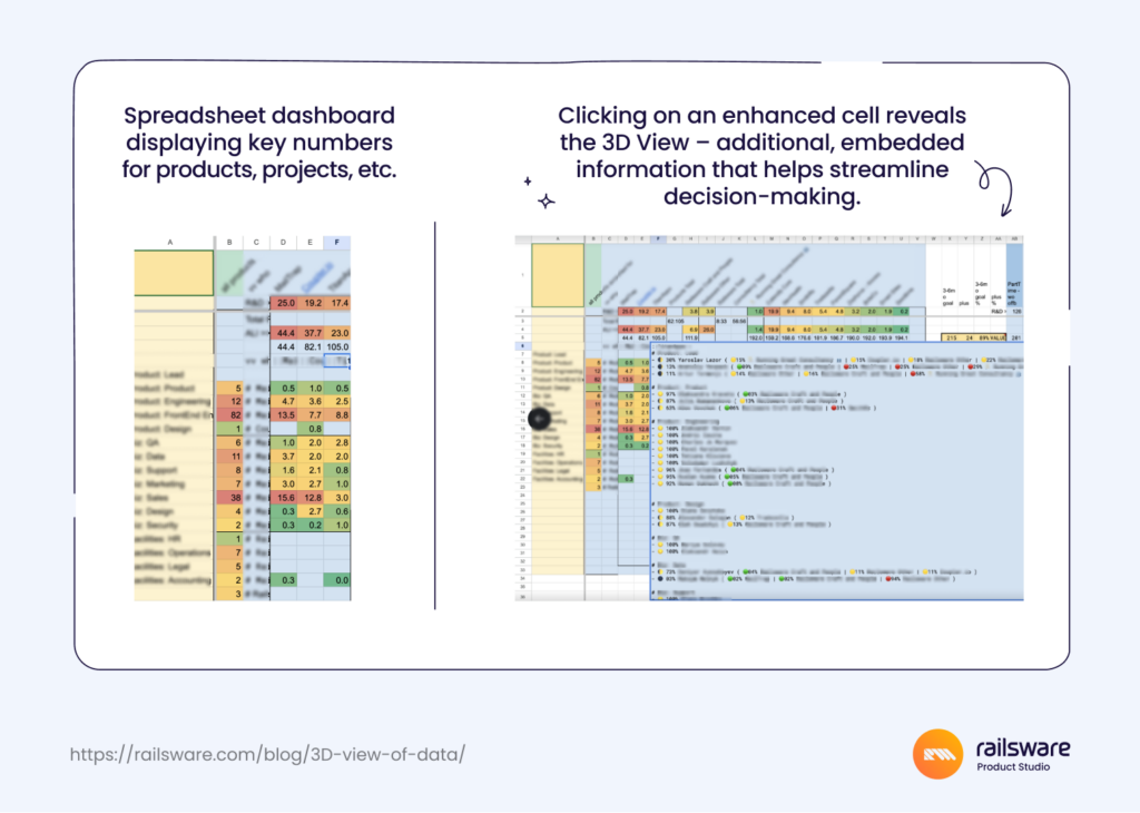
3D View of Data in action
For example, let’s say you are looking at a product team dashboard that contains information on all teams: engineering, design, etc. While reviewing marketing numbers, you decide to dig a bit deeper into team allocations. You want to know why the team number says 6.5, for example, and not just 6.
Instead of switching to another tab and scanning your org map, you click on the cell labeled ‘marketing’ in the spreadsheet, revealing a neat list of names, roles, and percentage of allocation to each marketing project. There it is – the 0.5 in your team number accounts for a part-timer or someone with a 50/50 allocation between 2 projects.
Here’s a similar example from a Railsware company overview dashboard (otherwise known as one of my ‘dashboards of dashboards,’ built to consolidate key data from projects, products, and functions). The right side of the image demonstrates a 3D View of one of our product teams. The data is ordered by function and extent of allocation.

I call this approach ‘3D View of Data’ because it brings clarity and dimension to numbers on the screen. It’s almost like looking at a cutaway drawing of a multi-story building. Imagine a structure that holds all of your business data: each floor represents a different function, and every room stores specific insights.
Instead of taking the metaphorical elevator up and down, you see related information displayed side by side. The magic of this approach lies in choosing what you see, exactly when you want to see it.
Why take a 3D View approach to data analysis?
Before I dive into the benefits of this approach, let’s take a step back and examine why many business leaders struggle with data-driven decision-making.
- Analysis paralysis is real. The more information we have at our fingertips, the harder it can be to reach a decision. Throw decision fatigue into the mix and the process becomes even more challenging.
- It requires focus, yet distractions are everywhere. Not only are we juggling dozens of other contexts and priorities, we’re also fighting with our own attention spans. Something as simple as switching to another tab (while gathering data) can be enough to derail our focus.
- It’s time-consuming to gather and analyze data. When the process isn’t managed properly, we lose precious hours and end up more confused than when we started.
- Poorly designed dashboards can be silent saboteurs. Nuance is critical for C-level decision-making, yet it’s hard to find it in line graphs or pie charts.
Having dabbled in functions like finance and product management, I’ve seen how prevalent these issues are. And I’m no stranger to them myself. The fact is, data is useless if we don’t organize, automate, and analyze it properly with robust ETL tools and processes. The right tools and expertise are essential. But we also need practical approaches to help mitigate human weaknesses, like our shortening attention spans.
Key benefits of a 3D View of Data approach
What are the main advantages of creating a 3D View, for both business leaders and the organization as a whole?
- Streamlines decision-making. The more accessible your data is, the easier and faster it is to make data-driven decisions. It’s really that simple. Taking the time to implement a 3D view can potentially save you hours of task-switching, access requests, and procrastination in the long run.
- Enables deeper analysis. When you spot something unusual about a particular data point, it’s much easier to investigate and resolve concerns, without getting others involved.
- More holistic understanding of company operations. A 10-year-long study of top-performing C-suite executives identified one trait they all have in common: intimate knowledge of the whole business. Strictly from a company leadership perspective, a 3D View of Data helps you understand the context and triggers behind certain results, painting a more nuanced picture of your business health.
- Prevents information overload. The ‘hidden’ function of a 3D View allows you to easily manage the amount of information you take in while making decisions. It’s less permanent clutter in your dashboard, too.
- Helps maintain a flow state. By embedding crucial context into your dashboard, you’re less likely to break focus while problem-solving. Maintaining a flow state helps us achieve ‘peak performance,’ ensuring we make decisions with a clear head.
- Makes strategic planning sessions more efficient. Product and company strategy meetings are for mapping out the big picture and solidifying new directions. Of course, you need data for that – but it’s not always possible to predict what information you’ll need access to in the moment. The more detailed your ‘dashboards of dashboards’ are, the more productive your strategic planning sessions will be.
To complement the 3D View of Data, business capability modeling can add an extra layer of strategic clarity. By mapping key business capabilities and their data dependencies, this method provides a structured way to align data with broader business objectives. Together, these approaches enable leaders to see not only the data but also how it ties into the organization’s operational strengths, driving more informed, strategic decisions that align with long-term business goals.
The main takeaway here: enhancing the functionality of your trusty, go-to dashboards is one of the most convenient ways to streamline data-driven decision-making.
Why use spreadsheets to build a 3D View?
After all of that, you might be wondering – why use spreadsheets in the first place? Why not play with other, more ‘sophisticated’ data visualization tools to get a similar result?
Trust me, it’s no accident. There are several reasons why we use spreadsheets (specifically GSheets) to design ‘dashboards of dashboards’ and solutions like 3D View of Data.
On the one hand, it’s a personal preference. We are heavy Gsheets users at Railsware and always have been. It’s our go-to for data analytics across several functions: finance (of course!), HR, product management, and so on. Is it any wonder that Coupler.io, our data analytics and automation platform, started as a GSheets add-on?
On the other hand, we use spreadsheets because they are:
- Highly customizable, allowing for the implementation of approaches like a 3D View and other automations or UI enhancements (extended view to display more data, custom visualizations, etc.)
- Supportive of countless integrations, ensuring we can extract data from a huge variety of business sources.
- Easy to use with a low learning curve. Anyone, regardless of their specialization, can grasp how to use and interpret spreadsheets.
Next steps and alternative approaches
Small warning: implementing a 3D View of Data requires some amount of technical knowledge: custom spreadsheet formula, data extraction, etc. For best results, I’d recommend working closely with someone from your data analytics team.
Just remember – it’s up to you to define the connections. Where can you close gaps in your understanding? What type of connections could save you time? e.g. product MRR + deeper insights into user churn and paid signup fluctuations.
On the other hand, not every dashboard in your organization needs a ‘3D’ enhancement. As I mentioned earlier, this approach is best suited for ‘dashboards of dashboards,’ i.e. wide spreadsheets containing key metrics from multiple products and functions.
In general, our teams use a combination of spreadsheets and visualization-heavy dashboards to inform decision-making. It all depends on team preferences and use cases.
But with an incredible product like Coupler.io at our disposal, it’s easy to blend data visualization approaches. If you aren’t ready to implement a 3D View of Data approach, I’d recommend checking out Coupler.io’s range of dashboard templates for sales, finance, marketing, and more.
For tailored advice on how to organize, visualize, and automate your business data, book a consultation with our team of data experts.
Final thoughts
Companies that want to embrace a data-driven culture must start at the top. It’s up to business leaders to lay the groundwork by adopting the best tools and techniques. While a 3D View of Data approach isn’t a silver bullet, it’s a step in the right direction.
To quickly recap, what can you gain from a 3D View of Data approach?
- A more streamlined decision-making process and higher confidence in business decisions, thanks to accessible data.
- Faster way to investigate perceived data discrepancies and understand the logic behind unusual numbers.
- Improved focus. No hopping from dashboard to dashboard in an attempt to join all the dots.
- Spreadsheet dashboards that are much more powerful, organized, and suitable for day-to-day data analysis.
If a 3D View of Data sounds promising, you might also be interested in BRIDGeS, our framework for multi-context decision-making, and theHeart – our approach to building customer-centric products from the start. And if you happen to be looking for a product development partner, don’t hesitate to get in touch with our team.