
This is exactly the problem I faced 4 years ago when I joined the Coupler.io team. At first, working in a single file wasn’t a problem. However, with the product growth, complications emerged. I saw the need to create a clear design system architecture that would allow the whole team to easily create and manage all the related design elements in Figma. And this is how I did it.
The peculiarity of our work
Unlike many other teams, Railsware is built on collaboration and pair/group work. We believe that this is the only way for all team members to know the context of a product, be able to share knowledge, and make decisions that would only benefit the product.
In my case, I often collaborate with product owners, product managers, developers, QA engineers, marketers, and content writers – all to ensure the end users get a user-friendly, intuitive solution.

The product I work on has an ecosystem that consists of an application, various databases, dashboards, and other files that it can generate, a G-suite add-on, a marketing website, and other marketing materials.

The main problem
When several people are working on one matter without a clear design system architecture, things get complicated. And then, a day comes when you can’t find an asset you need, see a lot of duplicates, or can’t explain to a newcomer how and where to get a design asset.
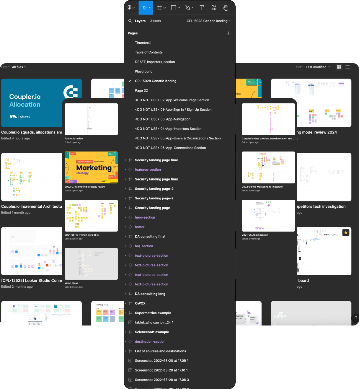
Here’s how our Figma looked before. As you can see, it was a pile of random files with vague names or without them at all, and a lot of trash files no one knew anything about.
How we solved the problem by establishing a design system architecture
The brainstorm
Before you tackle any problem, you need to make sure you see the holistic picture of it. In my team, we use different instruments to collect, sort, and prioritize information. The one we use the most is BRISGeS – a decision-making framework created by the Railsware team. BRIDGeS allows you to visually structure data and come up with the most optimal solution.
I invited my team and initiated a BRIDGeS session. At first, we defined the Subjects – people who would benefit from solving the problem. In our case, these were specialists engaged in the design process – Product manager, Product designer, Marketer, Engineer, Vendor.

Bear in mind that at the time of that session, BRIDGeS was raw, and we didn’t even have our fantastic BRIDGeS FigJam yet to make the brainstorming process not only fruitful but also eye-pleasing. But let’s get back to the point.
After that, we listed all the B (benefits the Subject can get from the future solution), R (risks that the Subjects may experience in the future), I (issues that the Subjects have right now), and D (domain knowledge, we need to keep in mind while resolving the main problem).
Issues identification
Among the biggest identified Issues were:
- Figma loading time. As there was one file for everything, over time, it became so large that the loading time could take from several minutes to several days.
- Unclear flow/screen statuses. When many people are working on different aspects of a product, it’s hard to track all activities and even harder to understand if the screen is ready for development, or if it has been approved.
- Inability to find a necessary element quickly. In a single file, new entities appear every hour, making it hard to track changes even with a version control system. Imagine a marketer needing an icon for a new email campaign. If they cannot find it quickly, they will ask you to create it (again!).
- Every file contained a pile of rubbish. The design of an asset, like a landing page, requires brainstorming and several iterations. Each such session resulted in elements that were reworked, or rejected. If a responsible person isn’t a participant in such an activity, they will find a pile of strange elements they have no idea what to do with. Comments in Figma are also worth mentioning. When non-resolved they cause more questions than answers.
- Difficult to onboard new team members. If you don’t know the structure of your file system, how are you going to explain it to a newcomer?
- Inconvenience to test a certain flow. When you have everything piled up in one place, the only reasonable way to test a certain flow is to duplicate it somewhere else. This is exactly how you worsen the problem and create even more strange files with duplicated content.
- Problems with access for 3rd party vendors. There’s a need to give your vendors different levels of access to different materials, which is impossible if you have one file for everything.
Coming up with the solution
Once we had the holistic picture decomposed on the board, we started thinking about the solutions. Since there were numerous issues, we needed a list of actions to solve them all. Here are the steps we defined that helped us create a clear design system architecture for the Mailtrap.io team:
1. Upgraded Figma plan to make it more flexible for the team.
2. Made a list of the main activities on the product and created a separate folder for each of them.

3. Reviewed and provided access to specific folders to each specialist/vendor depending on the real necessity.
4. Created icon libraries, press kits, and presentation templates that marketers and other specialists could easily reuse.

5. Made a specific UI-kit for data analysts who work with software like Looker, PowerBI etc.

6. Created pages in files dedicated to each step of the workflow to:
- separate ideas from approved materials
- add clarity about the status of the materials.

7. Created spaces (playgrounds) for different projects to give teams the ability to brainstorm and experiment freely.
8. Established rules on naming in storybook and ui-lib (like “button_login.png” for a button and “logo_company.png” for a company logo).
9. Established color-coding principles to mark different parts and processes of the product.

10. Scheduled regular syncs with designers and other team members to maintain and improve the design system architecture.
11. Ran workshops for data analytics, marketers, and other specialists when necessary.
Wrapping up
If you are alone dealing with a product design and a single Figma file works for you, then that is fine. However, be ready as over time, this approach will cause more and more complications, and you’ll need to reconsider the approach at some point.
This is why I highly recommend you create rules and conventions for naming, color-coding, and folder covers from day 1. Don’t hesitate to create new folders when the product grows, and upgrade your Figma plan when your team expands.