

The copy is ready. The product story makes sense. And the piece still can’t ship, because it needs a visual that doesn’t exist yet.
That was the bottleneck in my job for years.
I’m a content marketer working with Atlassian Marketplace apps, and most of what I do sits at the point where AI for content marketing stops being about writing.
Most of my work starts with technical product context: Jira screenshots, workflows, release notes, app features, webinars, and educational material for users and admins. Turning that into something people understand takes visuals, and visuals meant a separate production cycle every time.
A landing page needs product shots. A blog post needs an infographic. A webinar needs slides. A Marketplace listing needs screenshots showing the app in a realistic workflow. A website update needs a structure everyone agrees on before development starts.
None of that is writing, and all of it sits between me and shipping.
This article covers what I actually produce now, what the setup costs before any of it works, and where I still stop and hand the work to someone else.


TL;DR
- AI earns its place on first drafts and internal references, not final branded assets. The further something is from publish-ready, the bigger the win.
- A real brand system beats a clever prompt. Upload actual Figma assets, then save every approved output as a reference.
- Populated screenshots tell a product story. Empty demo instances show an interface. They’re not the same thing.
- Infographics can now happen while the idea is still fresh, instead of after the content has lost momentum.
- A mockup exposes copy problems a document hides. Sections read differently in a layout.
- AI can’t judge product accuracy, claim safety, or differentiation. That part doesn’t move.
What Claude Design is actually good for
Claude Design is good at first drafts and internal references. It’s not good at finished, branded, publish-as-is work.
That distinction runs through everything below, so it’s worth being precise about it.
Anthropic describes Claude Design as a tool for creating and refining visual work through conversation, inline comments, and direct edits, with examples spanning product mockups, presentations, landing pages, and campaign visuals. My use is narrower than that, and deliberately so.
The assets where it helps most share a property. Nobody was ever going to design them properly. A screenshot with realistic data, a workflow diagram inside a blog post, a rough layout to check whether the copy holds up, a site structure the team needs to agree on. These weren’t waiting in a designer’s queue. They were waiting for me to find time, which usually meant they shipped thin or didn’t ship at all.
The assets where it helps least are the ones with a real quality bar attached. A branded hero visual. Anything that carries the brand on its own. Those still go to a designer, and they should.
So the useful question isn’t whether AI replaces designers. It’s which parts of your visual layer never had a designer in the first place.
That’s where the time was going.
Start with a real design system in Claude
None of this works until you build a proper design system in Claude from assets you already have.
We created our design system in Claude from the Figma branding assets we’d already been using with our freelance designer. Logos, colors, gradients, components, cards, buttons, illustration style, slide formats, and infographic guidelines. All of it went in.
That changed what those assets were for. They stopped being a package we handed over to a designer and became a system we could produce from ourselves.
But this isn’t upload-and-it-works.
Claude’s own documentation on design systems says they can be built from codebases, slide decks, brand guideline assets, logos, color palettes, typography specs, screenshots, and design references. It also recommends using real examples and iterating when the first extraction doesn’t capture the brand well.

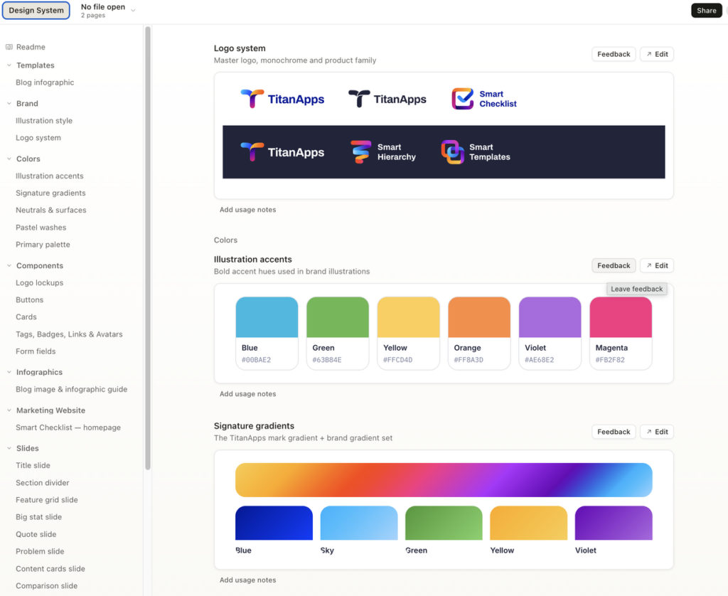
That matches what happened. The first interpretation is often close but generic. Sometimes it misses the spacing or the hierarchy. Sometimes it looks polished and still doesn’t look like us.
So the real workflow has more steps than the pitch suggests:
- Upload the brand assets.
- Let it produce a first interpretation.
- Review, correct, and refine.
- Push it closer to the brand.
- Save what you approve as a reference for next time.
The first result is rarely the win. The win is step five, because the reference library is what makes every following asset easier. Over time that matters more than any individual prompt.
This is where I’d push back on most AI design advice. Prompts matter. Detailed brand guidelines matter more. Without a strong system underneath, output drifts straight into the generic SaaS look everyone is trying to avoid.
Show the product actually working
A screenshot isn’t proof that a feature exists. It’s how a buyer imagines the product in their own workflow.
This is the task I’d disliked for most of my career in SaaS writing, and it sounds trivial until you have to do it every week.
Product pages, blog posts, Marketplace listings, webinar decks, and LinkedIn articles all need screenshots showing the product in use. Demo accounts are usually empty, too simple, or full of internal test data that tells the wrong story.
For Marketplace apps, a usable screenshot can mean building Smart Checklist examples, setting up template scenarios, populating dashboards, adding service requests, creating request types, assigning tickets, setting statuses, and generally making the screen look like somewhere work happens.
Analytical dashboards are the hardest. You need data density. One or two tickets communicate nothing. The reader needs enough examples to understand what kind of information the product can surface.
And the person who knows the product best often can’t hand you a polished scenario. You build the workflow together during the conversation. The functionality is right, but the names, statuses, request types, and numbers were never chosen with marketing in mind.

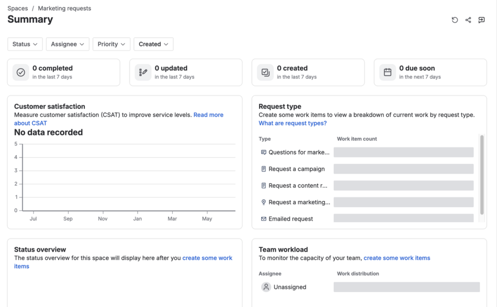

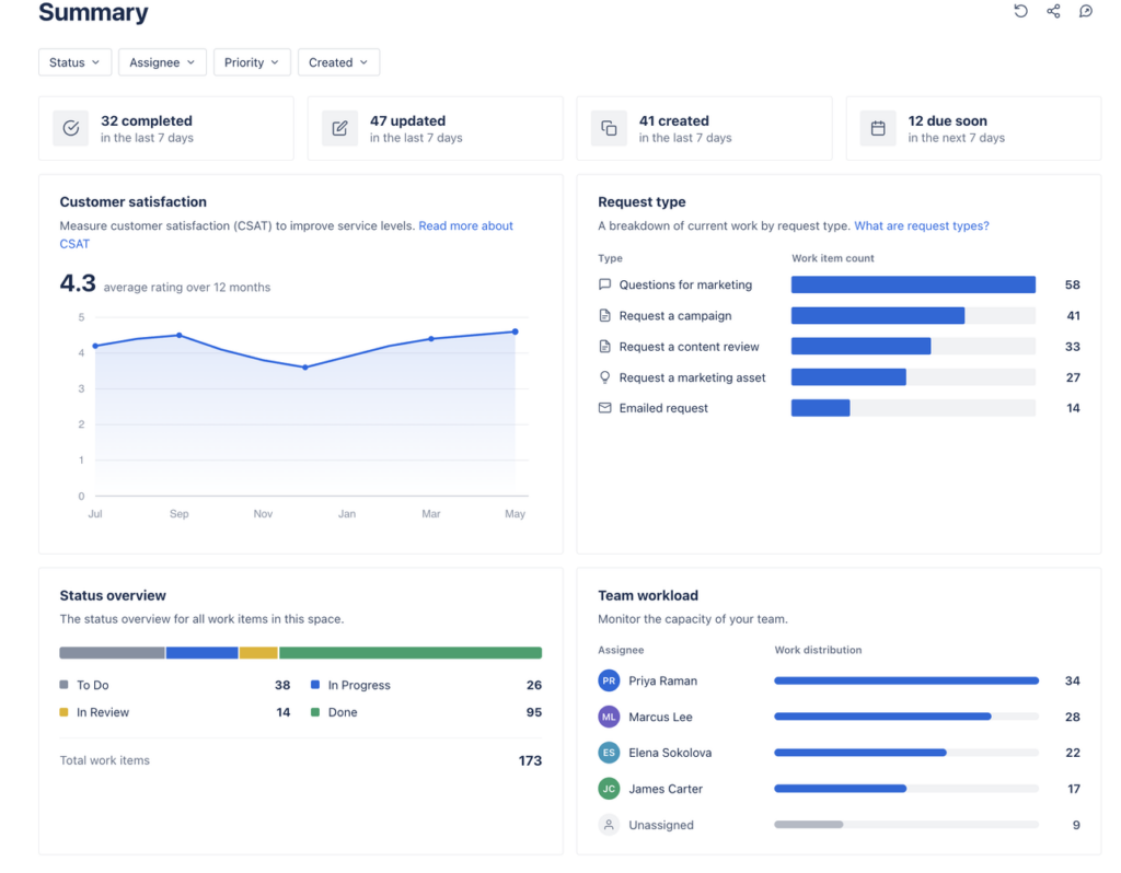
The difference between those two screens isn’t decoration. It’s strategic.
The empty one shows an interface. The populated one shows a product story. It gives the reader enough context to understand what requests exist, how work is distributed, what the dashboard measures, and why any of it matters.
AI doesn’t decide the scenario for you. You still define the story, check the terminology, and make sure the data is credible. What it removes is the manual work between an empty product surface and a screenshot that communicates something.
Explain the concept while it’s still fresh
Visual ideas usually arrive mid-writing, and that’s exactly when they’re hardest to act on.
You’re shaping an article or a webinar and you know precisely what needs explaining. A workflow difference. A product concept. A decision users get wrong. The idea is clear in your head.
Turning it into a visual used to mean a separate cycle. Prepare context, explain the idea, wait for a first version, review, comment, wait again. That cycle is right for high-stakes branded work. For educational content it’s slow enough that the piece loses momentum before the visual arrives.
With the brand system and reference assets already in place, I can test a visual concept much earlier. Before involving a designer, and before deciding whether the idea is even worth developing.

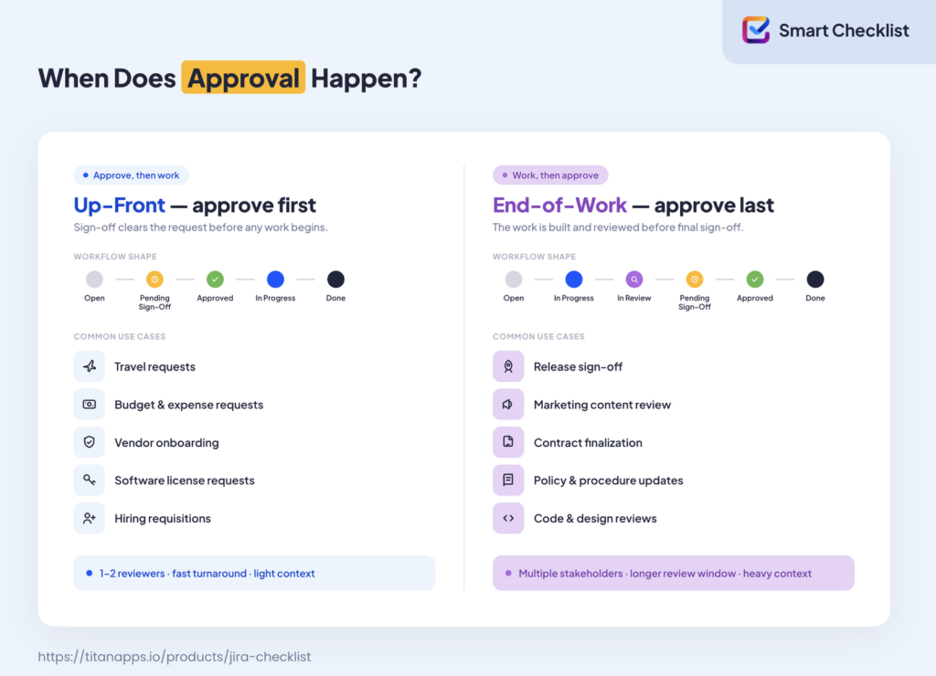
That example came from an article on Jira approval workflows. The goal wasn’t decoration. It was explaining one thing: approval can happen before work starts, or after work is completed.
That distinction matters because different approval models suit different work. Travel requests, budget approvals, vendor onboarding, release sign-off, content review, policy updates, and design reviews all need approvals, but not at the same point in the process.
A paragraph explains that slowly. The infographic shows two patterns, connects them to real use cases, and hands the reader a mental model in one glance.
That’s the whole value here. Product education becomes a visual explanation while the idea is still worth explaining.
Turn copy into a landing page mockup before the page exists
A landing page mockup exposes problems a document hides.
Landing pages are a natural fit here, because the messaging and the page structure are already mine. I prepare the hero copy, the section order, use cases, feature blocks, proof points, CTAs, FAQ, and comparison sections. Then I ask for that copy to be placed into a layout so I can look at it.
I used to do a version of this by hand. When I started in IT about ten years ago, I worked in Figma alongside a designer. I could build basic mockups, move sections around, and test layout ideas. It was useful and genuinely fun, but it took real time from both of us.
What changed is how early I can do it.
And it matters, because copy behaves differently on a page than it does in a document. A section that reads clearly in Google Docs can feel heavy in a layout. A hero that sounds strong on its own needs less explanation once it sits next to a screenshot. A use-case section often wants cards instead of paragraphs. A CTA can be technically present and visually buried.
You find all of that in a mockup. You don’t find it in a doc.
For teams working with designers, this doesn’t remove the designer. It gives them a stronger brief. Instead of sending a copy and asking for a layout, I can hand over a narrative, a hierarchy, and a first attempt at how it might work. They still improve spacing, responsiveness, polish, illustration quality, and brand consistency. The difference is that the first conversation starts from something concrete.
For smaller projects, you can often get far enough to test the concept before committing more time to design or development.
Keep a whole series looking like one thing
Consistency across formats is harder than any single asset.
I use the same approach for presentations: Atlassian Community Events, webinars, and other educational sessions. I can’t show those files here because they’re too large, but they’re where a shared design system earns the most.
Community and webinar content sits between education, product storytelling, and thought leadership. It shouldn’t feel like a sales deck. It also can’t be so abstract that people miss the practical workflow.
These decks need a wide mix of slide types. Title slides, section dividers, problem slides, comparison slides, workflow diagrams, big-stat slides, quote slides, product examples, and educational visuals.
The benefit isn’t only that first drafts arrive faster. It’s that webinar visuals, blog infographics, landing page sections, and LinkedIn graphics all come out of one system. They start to feel like parts of the same content operation instead of assets made in four different tools. That consistency is difficult to hold when a small team is moving quickly across several production workflows at once.
Map the website information architecture before anyone builds
The least obvious use is the one I’d defend hardest: mapping website information architecture before the work moves into execution.
When you plan website changes, you’re not always making a public asset. Sometimes you’re making a shared reference for the team.
Adding solution pages or resource pages raises information architecture questions that aren’t about design at all. Navigation. Dropdown structure. URL patterns. Page types. Search intent. Interlinking.
The old version of this was writing a technical task, building a long document, explaining it in a meeting, waiting for development, and then discovering that three people had pictured three different structures.

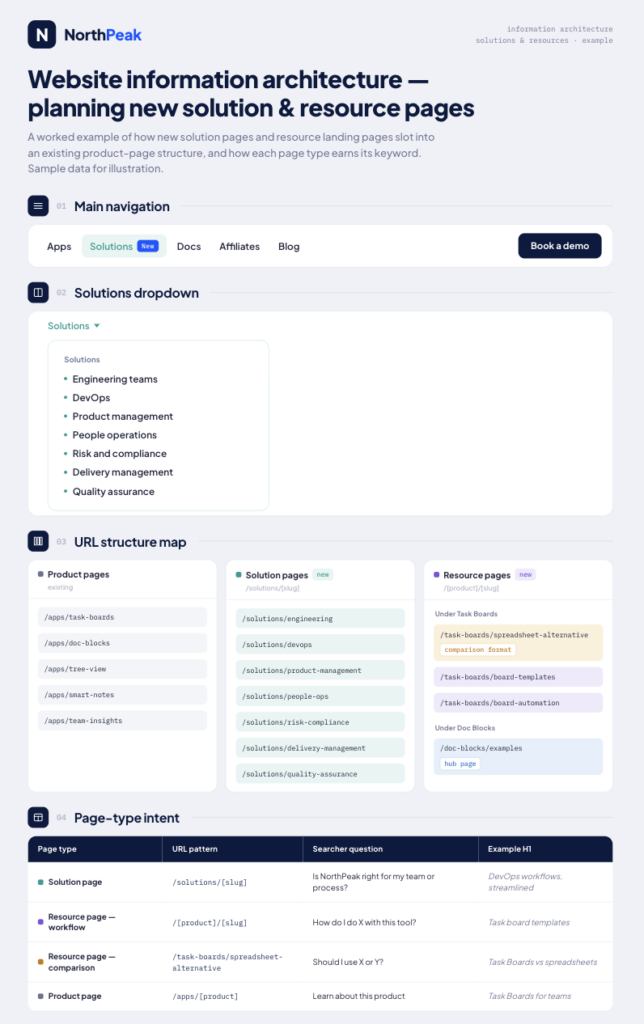
That scheme shows the main navigation, the solutions dropdown, the URL structure for product, solution, and resource pages, and the intent behind each page type.
It does something different for each person who reads it. For me, it connects content strategy to implementation. For a Head of Marketing, it makes the site logic reviewable. For developers, it’s a concrete reference. For the content team, it ties future pages to search intent and internal linking.
Sometimes the biggest time-saver isn’t a finished asset at all. It’s a shared reference that prevents misalignment before anyone starts building.
The workflow, start to finish
The process isn’t complicated. It does need discipline, and skipping steps is what produces generic output.
Start with real brand assets. Figma files, logos, color palettes, typography, gradients, components, product screenshots, slide examples, infographic references, website examples. “Make it modern” is not a brand system.
Add product context. For Marketplace app content that means what the app does, who the asset is for, which workflow it supports, what pain point it solves, and what someone should understand in the first few seconds.
Ask for a critique before you ask for output. This is the step most people skip and the one that changes the result most. What’s unclear in this screenshot? What would a Jira admin not understand? What’s visually noisy? What value is missing? What should be highlighted first? The answers change what you ask for next, which is the point. Generate first and you end up polishing something that shouldn’t exist.
Then ask for the first version. A populated screenshot, an infographic, a landing page mockup, a slide, a structure scheme, a LinkedIn visual.
Refine it, always. I correct hierarchy, cut generic elements, adjust the visual logic, simplify copy, check product accuracy, and push it back toward the brand system.
Save what you approve. Once I have a version I like, it goes into the reference library. Over time this matters more than any individual prompt, because better references produce better output.
That last step is the compounding one. Everything else is just care.
What Claude Design still doesn’t do
The useful part is speed to a first draft. The risk is mistaking that draft for finished work.
It produces polished output that fails strategically. Something can look clean and still misunderstand the product context, fall into generic SaaS patterns, miss brand nuance, or build a layout that’s pleasant but wrong for the buyer. Copy that fits the layout usually still needs rewriting.
It doesn’t know if you’re right. It can’t tell whether a workflow is accurate, whether a claim is safe to make, whether a screenshot scenario is realistic, whether the message is differentiated, or whether a page structure supports the business goal. Every one of those is judgment, and every one stays with the marketer.
It drifts without constraints. Without a real brand system it defaults to the same look as everyone else. The system isn’t an optional setup. It’s the thing doing the work.
It doesn’t replace a designer. When an asset matters enough, it needs a designer’s eye. What changed is how far I can get before that point, and how much better the brief is when I hand it over.
None of this is an argument against using it. It’s the reason the workflow above has a critique step at the start and a refinement step at the end.
Making product value visible faster
The bottleneck was never writing. It was everything between a finished message and a visible one.
Empty product screenshots. Infographics that arrived after the article lost momentum. Landing page mockups waiting on capacity. Presentation design gaps. Website plans that lived in a document nobody pictured the same way.
Those are the problems this solved, and none of them were ever going to get proper design time. That’s exactly why the win was there.
But it works because of what sits underneath it. Detailed brand guidelines. Real product context. Human review at both ends. A designer for the work that deserves one.
Not replacing designers. Making product value visible faster.
FAQ
What is Claude Design?
It’s Anthropic’s tool for creating and refining visual work through conversation, inline comments, and direct edits. Anthropic’s own examples span product mockups, presentations, landing pages, social assets, and campaign visuals. In practice it works best when you give it a real design system rather than a description of one.
Do I need a designer at all if I work this way?
Yes, for anything that carries the brand on its own. This approach covers assets that were never going to get design time: screenshots, explanatory diagrams, internal references, rough layouts. Branded visuals and high-stakes pages still need a designer, and the brief you hand over is better for having a first version attached.
What do I need before I start?
Real brand assets, not a description of them. Figma files, logos, color palettes, typography, components, and examples of slides and infographics you’ve approved. Without that foundation the output drifts generically, no matter how good the prompt is.
How long does the setup take?
Longer than one session. The first interpretation of your brand system is usually close but not right, so you review, correct, and push it closer. The real investment is building the reference library over time, and that pays back on every asset after it.
Can I use this for product screenshots if I don’t know the product deeply?
Only up to a point. You still have to define the scenario, check the terminology, and confirm the data is credible. Usually that means a conversation with whoever knows the product best. What this removes is the manual work of building the screen, not the responsibility for whether it’s accurate.

