
What is a product dashboard?
A product dashboard displays key information about a product’s performance in a single, centralized report. Generally, it includes information on user behavior, sales activity, and marketing impact. Depending on the metrics you choose to track, it may also provide specific insight into revenue breakdowns and the number of sign-ups, active users, and website/app traffic your product receives.
When it comes to making informed decisions and forecasts about your product, stakeholders need to rely on more than just their gut feeling. Let’s say you are in the middle of the digital product development process and want to understand how to make vital improvements to your MVP. Or maybe you’re restructuring your pricing plan and want to understand how this would impact your MRR. Product dashboards can provide you with actionable insights on-demand, allowing you to minimize risk and reduce manual work. And of course, as the saying goes: ‘You can’t improve what you don’t measure.’
Who uses a product dashboard?
Product managers, owners, and marketing teams are the primary users of a product dashboard since they often have to put themselves in stakeholders’ shoes and spot correlations between issues that might seem unrelated. Data-driven product managers typically have access to several analytics dashboards which they review on a daily/weekly basis.
We’ve dived deeper into the responsibilities of product managers in our SaaS product management handbook – feel free to learn more over there.
On the other hand, a product dashboard may also be shared with C-suite executives, external stakeholders, and potential investors when demonstrating the status and profitability of a product.
Why you need a product dashboard
So, now that we’ve established what a product dashboard does and who it’s for, here’s how it can help product teams…
Reduce manual work. There’s no need to waste time manually refreshing data. By creating auto-updated product dashboards, teams can redirect resources to other aspects of project planning and management. You can set up a schedule to update the information hourly, daily, weekly, etc.
Fix problems before they escalate. With a product dashboard, it’s easy to keep an eye on sudden peaks or drops in your figures. This ensures you have the chance to take swift action when issues arise.
Increase transparency. Dashboards help break down data silos within your organization by transforming raw, inaccessible data into a readable resource. Information can be shared more freely, which increases trust between teams and helps them make more informed decisions.
Absorb information faster. Many studies have shown that humans process visual information much faster than written or verbal information. Product dashboards are highly visual, which makes them valuable tools for decision-making, especially in fast-paced environments.

Metrics for a product management dashboard
Before you start thinking about what your dashboard should look like, you need to decide which metrics you want to track. At Railsware, we model our product management dashboards on the product funnel. In our experience, this approach gives us the best bird’s eye view of the customer journey and, in turn, the clearest insights into a product’s overall growth.
The AARRR Pirate Metrics framework forms the backbone of our approach. AARRR stands for Acquisition, Activation, Retention, Referral, and Revenue (check out our piece on product marketing funnel for more about this framework).
When crafting product dashboards for our clients or our own projects, we will add or remove certain AARRR elements, depending on how relevant they are to each individual product. For example, the product management dashboard for our data integration tool, Coupler.io, includes an additional metric: Awareness (which comes before Acquisition).
To demonstrate how we apply these metrics and visualize numbers, let’s take Coupler.io as an example:
- Awareness. The number of people who encountered the Coupler.io brand through marketing or sales campaigns. This includes channels like organic traffic, paid ads, blog posts, social media posts, marketplaces, or our affiliate program.
- Acquisition. The number of people who interacted with those campaigns and expressed interest in Coupler.io. This is measured by our click-through rate, site visits, and service requests. Note that the classical interpretation of acquisition refers to finding leads and that site visits typically fall under awareness. In Coupler.io’s case, however, we have decided to adjust this interpretation slightly.
- Activation. For Coupler.io, this has two separate definitions, both equally important:
- Sign-ups. The number of customers who signed up for a Coupler.io account or free trial.
- True activation. Users who have actually started to use the product, i.e. making the first data import.
- Retention. The number of customers who remained with us after signing up, and how active they are. Coupler.io’s definition of active is someone who is continuing to import data on a monthly basis.
- Paid. The number of customers who sign up for the paid version after the trial period has ended.
- Revenue. Coupler.io’s monthly recurring revenue (MRR). We also track annual recurring revenue (ARR), however, we don’t always include this metric on a product dashboard.
Here’s an example of a Mailtrap product dashboard that includes some of the aforementioned metrics, as well as some other, relevant choices:
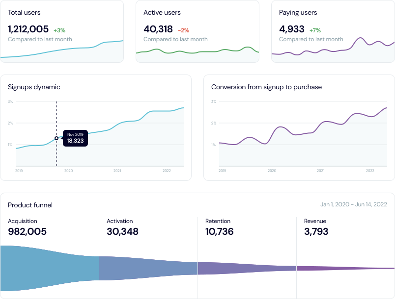
What about marketing metrics and sales metrics?
Of course, a product dashboard is much more than just a visual representation of your product funnel. As the above example demonstrates, it is more versatile and comprehensive — including not just static numbers, but historical data and a wide variety of relevant metrics.
The final list of metrics will depend on several factors, such as your product’s position in the business lifecycle, the type of digital product it is (SaaS, mobile app, etc.), what kind of features it includes, and your team’s needs/preferences.
So, here are some of the most important marketing, sales, and revenue metrics you may wish to include when creating your final dashboard:
- Customer Lifetime Value (LTV). The total amount of revenue you can expect to receive from a customer, throughout the period of time they are using your product.
- Customer Acquisition Cost (CAC). The cost of acquiring a new customer. It can indicate how effective your marketing or sales campaigns are and whether you should spend more or less money on them.
- Churn. The rate at which customers stop doing business with you. It can give you a strong indication of how happy (or unhappy!) your customers are. Bear in mind that if you have a freemium model in your pricing plans, you can’t track churn based on canceled subscriptions, as you will skip free users, who stopped using the product without ever subscribing to a paid plan.
- Average Revenue Per User (ARPU). The average amount of money generated by a customer during a set period of time. Unlike LTV, which tracks total revenue generated by a customer throughout their entire relationship with the brand, ARPU tracks how much revenue they generated over the course of a month, a year, etc.
We should mention that to dive deeper into the meaning behind your metrics, you should consult a host of other dashboards. Some examples of these might include client-focused SEO reporting and analytics dashboards, social media dashboards, paid ads dashboards, or product revenue report dashboards.
Custom dashboard vs using a template

Creating a product dashboard isn’t as simple as choosing a template and filling it with data. Just like crafting a product strategy, the process involves a lot of research, planning, and experimentation.
Let’s begin by pointing out that templates are quite useful during the early stages of product dashboard creation. We recommend playing around with them to get a feel for what your dashboard might look like and what it should include.
The templates we’re referring to are those offered by many billing, CRM, revenue, or web analytics tools. But they’ve got one major caveat: these default templates are the same for every product and business. As a result, they don’t properly represent your product and they aren’t very reliable.
Think about it this way: digital products have different monetization models (subscriptions, licenses, or one-time sales), different promotion models (marketing vs sales or paid vs organic), and different pricing models (freemiums, trial periods, or paid versions). It’s unlikely you’ll find a template that mirrors every important aspect of your product. And that’s why we recommend creating a custom dashboard and integrating data from multiple different tools.
Product funnel metrics give you somewhere to start. But you must also consider adding metrics that are true for your specific product, such as tracking trial period signups, referrals, etc. And of course, you will have to define each of these metrics differently according to how you sell or promote your product.
To demonstrate the importance of this, here’s an example of a time when we wrongly defined our churn and retention metrics for Coupler.io:
We observed (via Coupler’s product dashboard) that many users were reactivating their accounts, but we couldn’t understand why. To investigate this further, we took a second look at how we had defined churn for Coupler.io, i.e. if a customer did not use the platform at least once every 31 days, they were considered lost. However, this failed to account for users who only updated their reports on a monthly basis.
So, we decided to adjust the period to 32 days and observe the results. The very next day, we saw an increase in our retention rate and a decrease in our churn rate.
Ultimately, double-checking our definition of churn allowed us to avoid taking drastic measures to rectify the problem e.g. making changes to our customer onboarding process, launching an email marketing campaign that would encourage inactive customers to keep using the tool, etc.
So, to sum up, it’s not only important to choose the right metrics. You must also ensure that their definitions line up with the unique characteristics of your actual product.
Collaborating with a data engineer or data consultancy
As a product manager/owner, you may want to collaborate with a data engineer/analyst or data consultancy when creating your custom product dashboard. There are a couple of reasons for this…
It can take months to test different approaches, play around with mock-ups, and fix mistakes. Depending on where you are in the product development cycle, engaging in this whole experimental process could lead to critical errors and/or loss of revenue. So, it’s a good idea to enlist the help of a professional during the early stages. They can share expertise on how to connect data sources, add integrations, automate processes, and create data visualizations.
Additionally, it’s hard to take action on a data point when you don’t understand exactly what it means or why it’s important. Data analysts can also help you understand how to interpret your data. They can offer advice on what to look out for and how to automate alerts and updates.
However, it’s important to have just-in-time permissions enabled, as you possess information critical to the product’s success and future iterations. Granting access only when necessary protects sensitive data while still allowing you to collaborate effectively with the data professionals you bring on board.
Coupler.io is one such data analytics service provider that offers both consultancy services and a data integration tool. On the other hand, if you decide to tackle the design and testing stages yourself, we’ve got you covered with a list of recommended steps…
Steps to build product development dashboard
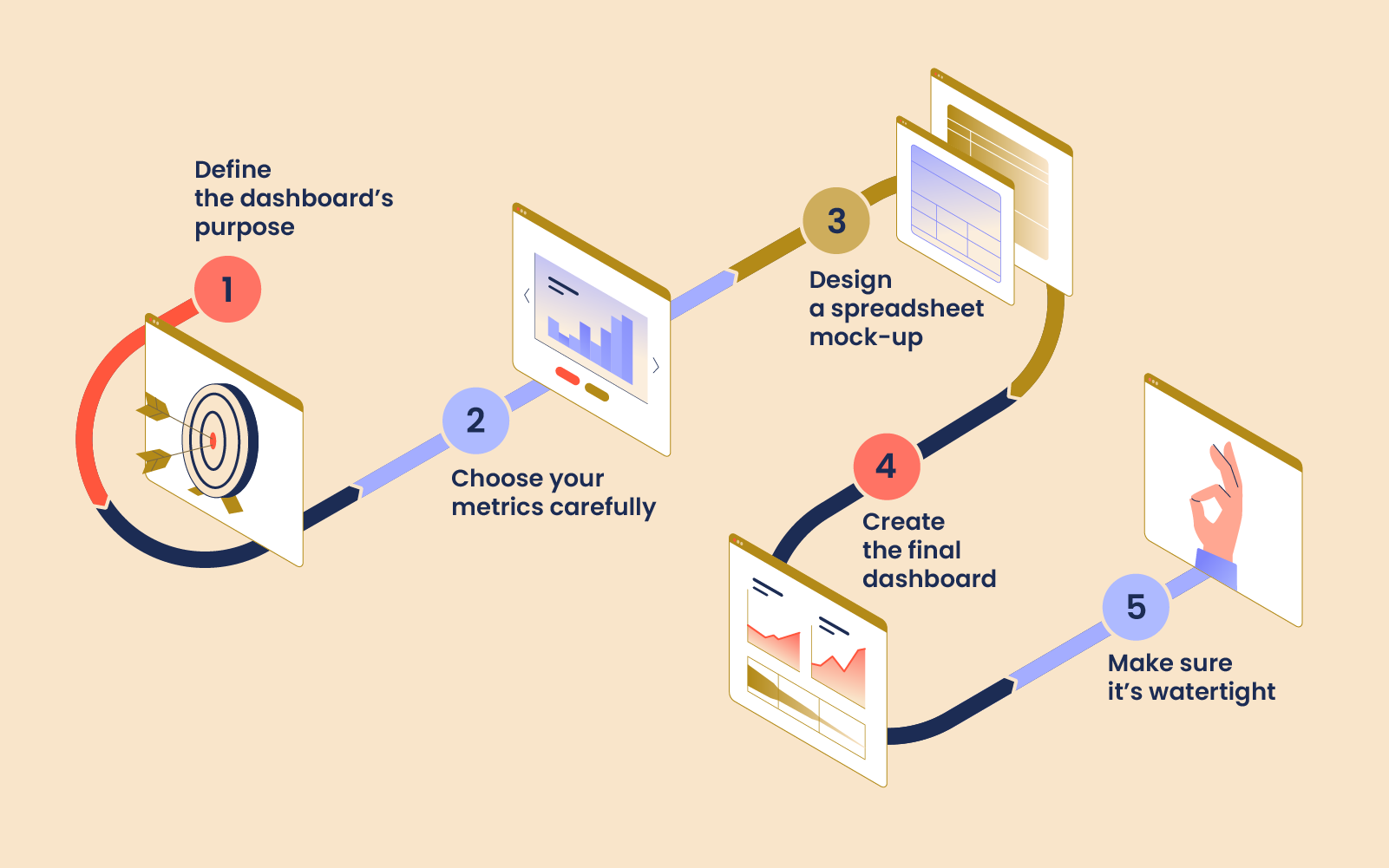
Here’s a broad overview of the steps involved in building a product dashboard:
Step #1. Define the dashboard’s purpose
It’s essential to define the goal and intended audience of your dashboard before you dive into the build. If your main goal is keeping tabs on task progress, deadlines, and team workload across projects, it might be worth pairing your dashboard with dedicated tools built for project tracking if you don’t want to build it from scratch. Without a clear purpose, you won’t be able to choose appropriate metrics and your team won’t know how to take meaningful action.
Ask yourself: will the dashboard be shared with other teams apart from product management (e.g., marketing, sales, engineering)? What do you want to achieve with it — monitor day-to-day statistics, or consult it every now and then when rolling out new features or functionalities? Variables like these affect how often updates would need to be scheduled, how many metrics would need to be included, and who would have access to the dashboard.
Step #2. Choose your metrics carefully
Metrics can make or break your dashboard. As we said, it’s vital to choose carefully so that the information you’re receiving is as relevant and reliable as possible. For product dashboards, we recommend starting with the product funnel structure outlined above. You can later tailor the dashboard to your needs by adding or tweaking certain metrics.
Whatever you do, don’t let vanity metrics take up valuable space on your dashboard. Vanity metrics are statistics that look good on paper but have no real meaning — think social media followers, total number of downloads (mobile apps), or total number of leads generated (without tracking conversions).
To avoid including them, ask yourself: will this metric give me the information I need to take direct action? If the answer is no, leave it out.
Step #3. Design a spreadsheet mock-up
Once you have chosen your data sources and metrics, it’s time to design a basic version of your future dashboard. For this task, we recommend using Google Sheets, since it’s a free and highly-flexible tool. Think of your spreadsheet mock-up as a testing ground. Start by taking some raw data and working out potential formulas; experiment with different layouts and decide which charts best represent your data.
Step #4. Create the final dashboard
By now, you should have a pretty good idea of how your final dashboard will look and feel. Creating it will be less complicated if you use a template, but for now, let’s assume that you are building a custom dashboard from scratch. This step will involve turning raw data into visualizations using a set of tools (see our list of recommendations further down this post).
We can break the creation steps into three general stages: data collection, data warehousing and integrations, and data visualization.
So, for instance, you could gather user data from your product website with Google Analytics (data collection), store and manage this information using BigQuery (data warehouse), and connect it to a data visualization tool (Google Data Studio) using Coupler.io (integration tool).
Step #5. Make sure it’s watertight
The final step is all about checking your dashboard for edge cases. Even with careful preparation, you probably won’t succeed in capturing the full picture the first time around — it may take a few iterations to get it right.
Some questions to ask are: Have you accurately defined acquisition, activation, and retention in the context of your product? Are there any metrics that you may have left out? Has your data been properly segmented?
During the first few months of use, pay attention to unusual patterns in your figures — this could be a sign that something isn’t quite right with your formulas or choice of metrics.
Dos & don’ts of creating a product dashboard
| Do: | Don't: |
|---|---|
| Use it to take action. If a dashboard can’t help you detect potential product issues, better connect with your customers, and make well-informed decisions, it’s not worth much. You might use it to monitor changes in customer behavior — say, a drop in the number of people signing up for the paid version of your product — so you can quickly investigate and get to the root of the problem. | Cram it with data points. Less is definitely more when it comes to connecting data sources and creating visualizations. Clutter will only confuse your goal and make it hard for you to find the information you’re looking for. Stick to including only the most important metrics (no more than 5-7 per dashboard). |
| Share it. Product dashboards are made to be shared. When the right people (e.g. product designers, content managers, analytics engineers) have access to fresh data, they are better equipped to craft new features, campaigns, and resources that respond to customers’ changing needs. | Prioritize form over function. It’s better to have a low-key, easy-to-read dashboard than a fancy one that doesn’t match your product’s needs. For maximum readability, pay attention to color theory and choose your visualizations carefully (for example, we prefer line charts to pie charts, since they are more versatile and easier to understand). |
| Look for inspiration. Search the web for template examples of product management, performance, or development dashboards and make a note of useful metrics and visualizations. | Set it and forget it. As we said, dashboards need regular monitoring in order to bring real value. Even if you don’t need to check a product dashboard on a daily basis, you should still schedule time in your week/month to examine it. This way, you will be able to catch issues or inconsistencies before they turn into major problems. |
How Railsware used product dashboards for decision-making
Nurturing a data-driven culture has enabled us to grow exponentially and take both our clients’ products and our own products — Coupler.io, Mailtrap, and TitanApps — to new heights. Product dashboards have played a big role in helping us get there.
1. Increasing Mailtrap’s revenue 4.66x in 3 years
Mailtrap is an email sandbox service for developers, crafted by Railsware. It emerged in 2011 as an in-house email testing tool, but it wasn’t long before our software engineers grasped its potential. So, we shared Mailtrap with the IT community. It became clear that they loved the tool as much as we did, and during those early years, word of mouth was a major growth contributor, which helped us keep our marketing and sales efforts to a minimum.
However, by 2017, Mailtrap’s user base was growing rapidly. We were getting lots of user requests to develop new features and had plans to scale the product. It was time to streamline our approach to growth — so, we built a custom, comprehensive product dashboard for Mailtrap. This gave our product, sales, and marketing teams access to a single destination where they could track and analyze vital metrics for future planning.
Mailtrap used this dashboard to plan a pricing redesign in 2019. Our team examined multiple data points (conversions from free to paid users, revenues by plan, etc.) to understand how users interacted with the product and which features they utilized the most. Then we determined how to set reasonable plan limits by examining the usage stats for different cohorts of users.
After some further planning and investigation, we decided to keep offering Mailtrap for free to casual users, while incentivizing frequent users to switch to a paid plan. A new pricing strategy was subsequently drawn up and rolled out. We quickly saw positive results, with 20% of free users upgrading to a paid plan after it went live. More importantly, in the three years since the change, Mailtrap’s MRR has grown a whopping 466%.
2. Understanding why Coupler.io’s activation rate took a hit
There was another case where using a product dashboard allowed us to respond quickly to a problem. At one point, we noticed a sudden drop in activation at Coupler.io (by checking our product dashboard) and an uptick in the number of support ticket submissions (by checking our customer success dashboard).
By investigating customer complaints, we realized Google had recently updated their API and Coupler.io no longer had permission to process an import for products like Google Sheets, BigQuery, etc. It was up to customers to provide this consent, and if they didn’t tick the boxes in the updated pop-up, they were prevented from adding new connections and fully engaging with Coupler.io.
So, we introduced a simple fix. When a customer added a new connection, an app would check whether they had ticked the permissions boxes. If they hadn’t, a pop-up appeared, prompting them to provide consent in order to complete the import.
Simply put, regular monitoring of Coupler’s product dashboard allowed us to catch this issue before it had the chance to cause lasting damage.
Tools to build product dashboard
Now, it’s time to turn all that raw data into actionable insights. Here are some tools that can help:
Early stage: Data collection
- Google Analytics – for gathering raw data on how customers are accessing/interacting/coming into contact with your product.
Intermediate stage: Data warehouses & integrations
You can pull data from Google Analytics and connect it directly to a dashboard without much effort. But when you start blending data from multiple channels (e.g. Facebook Ads, feature usage stats, etc.), the process becomes a bit trickier. You’ll need to rely on some more advanced data management solutions and integrations to make it possible:
- BigQuery – for storing and querying your data. Boasts seamless integration with Google Analytics and Google Data Studio.
- Amazon Redshift – a powerful data warehouse that can also run complex analytical queries.
- Google Sheets – for a free, low-key data management solution that allows you to create simple spreadsheet dashboards too.
- Coupler.io – for reducing manual work by creating seamless, automated connections between your data sources, database, and ultimately your dashboard.
- Stripe – for connecting analytics about your billing system and customer payments.
Final stage: Data visualization
- Google Data Studio – a free and easy-to-use platform that supports countless data connectors and integrations.
- Tableau – a leader in data visualization. Handles large data sets with ease and lets you create interactive dashboards.
- Microsoft PowerBi – a robust business intelligence platform with hundreds of data visualization options.
Wrapping Up
The process of building a product dashboard usually involves a lot of planning and experimentation. You must choose your metrics carefully, as the wrong choices can thwart the value of your insights, and prevent you from being able to act on them. Meanwhile, templates can help you shape the look and feel of your dashboard, but when it comes to building one that takes all of your product’s individual qualities into account, you should aim for a custom solution. By following best practices, collaborating with experts, and using the right tools, it’s possible to create a product dashboard that brings real value to your organization.