As it is well known by (almost) every Mac user who is alive and conscious, On October 27th Apple unveiled their updated notebook line. Although there are a ton of buzz about it being underpowered and overpriced, we would not rush to conclusions until actual devices will be shipped to the customers and real hands-on experience show if it’s a rare fail or just another triumph of this “fruit company”.
All other factors aside, the “killer” feature of the new MacBook Pro is the 2170x60px retina Touch Bar (equivalent to 1085pt by 30pt) with the Touch ID sensor. The Touch ID sensor looks like a very useful thingy for all paranoids (including yours truly) that still have a password on their mac. The rest of this shiny add-on is not that obviously useful and the use cases presented during the keynote did not prove the case well enough.
Let’s imagine how this feature could work with an app that all of the Railswarians use on a daily basis — Slack. We are actually not aware if guys from the Slack team are planning to take an advantage of this new functionality to improve already well thought-through UX of the app but sure hope so.
We will not go through a first-time user experience and onboarding process (we are just doing a sort of creative exercise here, it would be definitely considered otherwise), let’s assume that our target auditory is already familiar with Slack. Also, we are not going to cover all the cases the Touch Bar could be useful in, just a few.
So, let’s flex our design muscles and get cracking!
When Slack finishes loading and you are back to the last opened channel, the Touch Bar would help to put all important controls closer to your fingertips. Channel details is already expanded in this case:
By the way, we are going to bend rules of Apple guidelines here a bit and show unreads. It’s not new information and it is already displayed on the main screen, so it should not distract and going to help a lot if you just staring down on the Touch Bar. For example, when scrolling through your fellow Slack users. But let’s not get ahead of ourselves.
Next, when you’ve decided to become vocal and put your cursor in the message field (same happens when you change current channel), pre-cooked @channel (or @username in case of a personal channel), @group (in this case let’s imagine that we are a part of design team) and @here could save you some typing if you are going to say something more important than usual. When you’d start to actually put something in, quick type suggestions are going to take over:
Let’s tap the Quick Switcher. You can quickly search for a conversation or browse through personal and group channels. Which way of finding people to chat with works best for you?
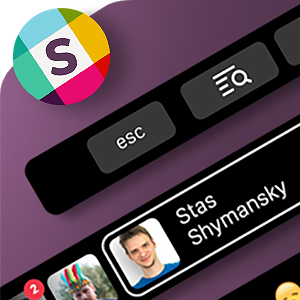
For an example, here are all of your beloved colleagues sorted by most frequent conversations. You can also sort them by recent, unresponded messages, starred and so on. And looks like we just found one more reason to ask some people to add real pictures to their profiles…
If you can’t recognize somebody — no worries, you can tap and hold to see the name and proceed to direct messaging (or not, up to you):
“+” (New…) options. Bring stuff in or start creating your own content:
Emoji. Plain text is sooo boring, right? Here are your most frequently used ones:
Not enough? All Slack categories are available:
And last but not least — some text formatting options that will appear if you select a piece of text. Very nice to have if you forget the syntax all the time or just as lazy as me:
That’s it for today! And you know what? I don’t mind to try using Slack this way, could be convenient. Well, let’s wait and see if the new MacBook Pro and the Touch Bar in particular as good (bad?) in reality as it is on paper.
I hope you had as much fun reading this post as we had while creating the concept. Please don’t hesitate to tell us what do you think about it and stay tuned!
P.S. Check out our corresponding Dribbble shot
