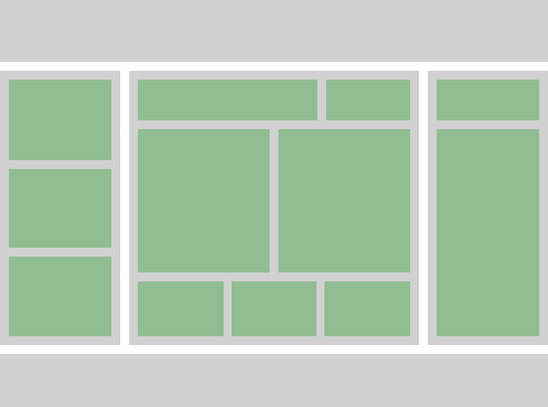
We’re already familiar with Modules, but they don’t fit when dealing with a site layout. When explaining Modules we’ve learned to think component-based.
Now, let’s add one more rule — Grids control width. It means that all Modules should be designed not to depend on width that gives more flexibility when placing them anywhere you need.
Creating a grid
Let’s take a closer look at a primitive layout example we see every day:

The Grid classes should be made location-free. Note a block with the class row that clears all the floats properly. Don’t forget about it.
/* The clearfix hack is a popular way to contain floats without resorting
 * to using presentational markup.
 * Credits: http://nicolasgallagher.com/micro-clearfix-hack */
.row {
  *zoom: 1;
}

.row:before,
.row:after {
  display: table;
  content: "";
  line-height: 0;
}

.row:after {
  clear: both;
}

/* Reserved classes for columns */
.col1of3, .col2of3 {
  float: left;
}

.col1of3 {
  width: 33.33333%;
}

.col2of3 {
  width: 66.66666%;
}
We’ve reserved some unique classes for the columns: .col1of3, .col2of3. All of them have float: left to behave like floats and width: xx% where xx is a percentage value from 0 to 100.
We’ve also reserved .row(clearfix hack) which is a popular way to contain floats without resorting to using presentational markup.
After inserting some test data inside, let’s take a look at the result.
Organizing more complex grids

Using grids with percentage width allows us to build quite complex layout.
Don’t forget to wrap columns with .row.
Let’s take a look.
Spaces
Now we know how to create fluid layouts, but usually you need to add some space between columns or blocks inside each column. Use spaces for that.
/* Should be used to modify the default spacing between objects
(not between nodes of the same object)
 * a, t, r, b, l, h, v = all, top, right, bottom, left, horizontal, vertical
 * x, s, m, l, n       = 3px, 5px, 10px, 20px, none
 * p, m                = padding, margin */

.mbl {
  margin-bottom: 20px;
}
As you can see in the comment line above, we can define paddings/margins for each side. Also, we can set the size. Let’s see how it’s made:
/* Large Padding size for all sides */
.ptl, .pvl, .pal { padding-top:    20px; }
.prl, .phl, .pal { padding-right:  20px; }
.pbl, .pvl, .pal { padding-bottom: 20px; }
.pll, .phl, .pal { padding-left:   20px; }

/* Large Margin size for all sides */
.mtl, .mvl, .mal { margin-top:    20px; }
.mrl, .mhl, .mal { margin-right:  20px; }
.mbl, .mvl, .mal { margin-bottom: 20px; }
.mll, .mhl, .mal { margin-left:   20px; }
Take a look at the Sass based version with 4 different sizes.
Use spaces to modify default spacing between objects (not between nodes of the same object).
TIP: Railsware site is based on a such grids + spaces system. Feel free to go and inspect the source and learn how we built it.
We’re not going to cover responsive layouts here since it’s worth writing additional post about it.
